WallMonkey’s is a well-known eCommerce site, providing custom Wall Decor for their customer’s offices, home offices, and businesses. Receiving a number of online orders, WallMonkey’s founders wanted to increase the number of online sales and ultimately, increase revenue conversions.
The Process
- Identify what the consumer is doing,
- Optimize the user experience,
- Design a flow that suited our consumers.
The Starting Point
Start at the beginning. So many Conversion Rate Optimization experts agree the rookie mistake is to start optimizing eCommerce sites at the end of the funnel – the checkout page. The assumption, this is where people must have the most issues since they are not checking out. But seldom is this the right place to start.
Constant testing shows the best place to start is at the top of the funnel. The Wall Monkey team starts to identify the consumer experience from this point.
And We Begin
Reviewing the heatmap for the homepage revealed consumers were starting their experience off by immediately searching and/or looking for the “best sellers” products. And very few consumers were clicking on the Shop Now button. 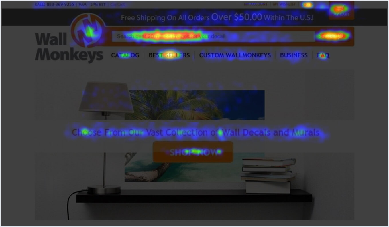
How could we improve the user experience with this knowledge? How could we bring more attention to the “Shop Now” button which would lead the consumers to the next step?
The test, change up the image. Draw the consumer eye to the middle of the page.
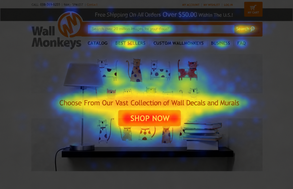
The Result
A 27% increase in direct revenue for the second variation (shown above). The more personal, fun and festive variation won by a large margin, drawing the consumer’s eye to the middle of the page and ultimately the CTA.
Do We Stop Here? The Answer … NO.
Consumers are still primarily searching when they hit the homepage. What if we move the search bar to the middle of the page. Replacing the existing CTA – Shop Now?
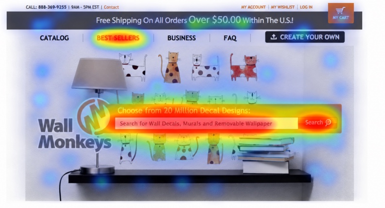
The Result
At the end of a 30-day testing period, there was a 550% increase in revenues.